As of 2022, the global smartphone user count has reached an impressive 6.5 billion, and this number is expected to surpass 7.6 billion by 2027. With the widespread use of various mobile and desktop devices to access the internet, the issue of device fragmentation has become a significant concern. Users today anticipate seamless browsing experiences on their mobile devices, requiring website developers to create designs that adapt flawlessly to a wide range of screen sizes worldwide.
Simply put, everyone is looking for a responsive design.
What is Responsive Design?
Responsive design is a superpower bestowed upon websites that allows them to intelligently morph and rearrange their layout, content, and elements based on the device they’re viewed on. Whether it’s a massive desktop monitor, a cozy tablet, or a tiny smartphone screen, responsive design ensures that the website looks stunning and functions flawlessly on all of them.
Responsive design is like a master conductor guiding an orchestra of pixels, making sure that every instrument plays harmoniously together. It considers the size of the screen, the capabilities of the device, and the preferences of the user. It might hide certain elements, stack others neatly, enlarge fonts, or reposition images—all in a quest to create a delightful browsing experience.
In a world where people use a variety of devices to surf the web, responsive design is the superhero that saves the day. It saves us from squinting at microscopic text on our phones, from endless scrolling on oversized screens, and from the frustration of zooming in and out just to navigate a website.
So, the next time you encounter a website that magically adjusts itself to fit your screen like a perfectly tailored suit, you’ll know the secret behind its wizardry: responsive design, the champion of adaptability, and the savior of browsing experiences.
What Are a Few Common Screen Sizes?
The best screen size to design for is a subjective matter and depends on various factors. In the past, website designers often aimed for a specific screen size, typically targeting the most common desktop resolutions. However, with the proliferation of devices and the rise of mobile browsing, the concept of a single “best” screen size has become less relevant.
Instead of focusing on a specific screen size, it’s more effective to adopt a responsive design approach. This means designing websites that can adapt and provide an optimal experience across a range of screen sizes and devices. By embracing responsive design principles, websites can gracefully adjust their layout, content, and functionality to suit the screen size of the user, whether it’s a large desktop monitor, a tablet, or a smartphone.
Considering the diversity of devices and user preferences, it’s essential to prioritize flexibility and usability. Designing with a mobile-first mindset has become a common approach, as smartphones are widely used for browsing. Starting with a mobile-friendly design ensures that the website is accessible and user-friendly on smaller screens, and then progressively enhancing the design for larger screens.
Ultimately, the goal is to create a seamless and enjoyable user experience across various devices, rather than focusing solely on a specific screen size. By prioritizing responsiveness and adaptability, designers can cater to the needs of users regardless of the device they choose to access the website.
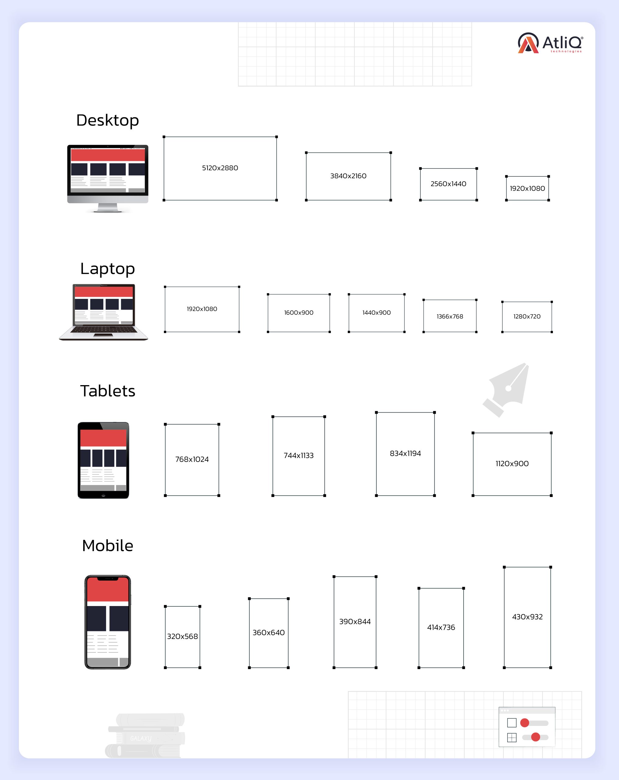
Common screen sizes can vary depending on the device and region, but here are some typical screen sizes found in popular devices:
It’s important to note that these are just a few examples, and screen sizes can vary across different devices and manufacturers. With the increasing diversity of devices, it’s crucial to design websites responsively, ensuring they can adapt to various screen sizes and orientations.
What Are the Best Practices for Implementing Responsive Design?
Implementing responsive design for your website involves following several best practices to ensure an optimal user experience across different devices. Here are some key guidelines to consider:
- Mobile-First Approach: Start designing and developing your website with a mobile-first mindset. Begin by creating a layout that works well on smaller screens and progressively enhance it for larger screens. This approach helps prioritize essential content and ensures a smooth transition to larger devices.
- Fluid and Flexible Layouts: Use fluid grid systems and flexible layout techniques, such as using percentages or relative units (e.g., em or rem) instead of fixed pixels, to allow your website to adapt to different screen sizes. It ensures that your design can scale proportionally and adjust to various devices.
- Media Queries: Employ CSS media queries to apply different styles based on screen size breakpoints. By defining specific CSS rules for different screen widths, you can optimize the layout, typography, and design elements for each device category. Media queries allow you to create responsive breakpoints that trigger layout changes as the screen size changes.
- Images and Media Optimization: Optimize images and media files for faster loading on mobile devices. Use responsive image techniques like srcset and sizes attributes to serve appropriately sized images based on the device’s screen resolution. Compress and optimize media files to reduce their file size without compromising quality.
- Touch-Friendly Elements: Design your website with touch-friendly elements to accommodate mobile and tablet users. Ensure that buttons, links, and interactive elements have sufficient spacing and are easy to tap or swipe. Avoid relying on hover effects, which do not apply to touch-based devices.
- Content Prioritization: Prioritize essential content and ensure it is easily accessible and readable on smaller screens. Use progressive disclosure techniques to hide non-critical content behind collapsible sections or expandable menus, allowing users to access it if needed.
- Performance Optimization: Optimize your website’s performance by minimizing HTTP requests, leveraging browser caching, and using techniques like lazy loading to load content as users scroll. Performance is crucial for mobile users who may have limited bandwidth and slower connections.
- User Testing and Iteration: Test your responsive design on various devices, screen sizes, and browsers to ensure consistent functionality and visual appeal. Gather feedback from users and make iterative improvements based on their experiences.
By following these best practices, you can create a responsive website that delivers a seamless and enjoyable user experience across devices, improving accessibility and engagement for your audience.
Top 5 Best Responsive Design Examples
We have carefully curated a list of five websites that are often cited as examples of excellent responsive design. These examples have been recognized for their effective adaptation to different screen sizes and devices.
Here are five noteworthy websites:
- BostonGlobe.com: The Boston Globe website is frequently praised for its responsive design. It seamlessly adjusts its layout and content to provide an optimal reading experience across various devices.
- Microsoft.com: Microsoft’s website showcases an excellent example of responsive design. It offers a consistent user experience by adapting its interface to fit different screen sizes, from desktops to mobile devices.
- Starbucks.com: Starbucks’ website is known for its responsiveness, enabling users to easily browse and access information, menus, and promotions regardless of the device.
- Smashing Magazine: A popular web design resource, Smashing Magazine has implemented a responsive design that caters to its global audience. Its content and layout adapt well to different screen sizes, ensuring a seamless reading experience.
- The Guardian: The Guardian, a renowned news publication, has embraced responsive design to deliver content effectively across various devices. The website adjusts gracefully, accommodating different screen sizes while maintaining readability and usability.
*Please note that the popularity and recognition of responsive design examples may vary over time.
In conclusion, determining the best screen sizes for responsive web design is no longer about targeting specific dimensions. It has evolved into embracing the concept of adaptability and designing websites that can gracefully adjust to various screen sizes and devices.
Being a leading digital product development agency, we at AtliQ Technologies understand the importance of responsive web design in today’s multi-device landscape. Our team of skilled designers and developers will employ a mobile-first approach, ensuring your website looks stunning and functions flawlessly on smartphones, tablets, and desktops alike. We will implement fluid and flexible layouts, utilize CSS media queries to adapt styles at different breakpoints, optimize images and media for faster loading, and prioritize content for smaller screens.
With AtliQ Technologies as your digital product development partner, you can be confident in our ability to deliver a responsive web design aligning with your business goals, captivating your audience, and providing a consistent user experience across devices.
Embrace the power of responsive design with AtliQ Technologies and unlock the potential of reaching and engaging users on any screen size.
