Ever spent hours crafting the perfect call to action (CTA), only to see website visitors seemingly ignore it? You’re not alone. Traditional analytics leave you guessing, but customer behavior heatmaps paint a clear picture. You’ll see exactly where visitors click (and where they don’t), revealing blind spots that are costing you sales.
Get ready to transform those “click here” pleas into a chorus of “add to cart!”
Here’s the basic idea: Heatmaps are visual representations of user interaction on a webpage. They use a color scale, with warm colors (reds, oranges, yellows) indicating areas of high engagement (clicks, scrolls, hovers) and cooler colors (blues, greens) signifying areas with less activity.
Think of it like a heat signature for your website. Hotter zones show where visitors are drawn to, what grabs their attention, and where they take action. Conversely, cooler areas reveal content that might be getting skipped or elements that are confusing or difficult to interact with. By analyzing these heat signatures, you gain valuable insights into user behavior. You can see if your CTAs (call to action buttons) are prominent enough, if your product placements are effective, and even where visitors might be getting lost on your site. This intel is like gold for website optimization, allowing you to tailor your pages for a smoother user experience and ultimately, more sales.
Key Heatmap Insights for Sales Optimization
Customer behavior heatmaps offer a treasure trove of data, but how do you translate that data into actionable insights for boosting sales? Let’s dive into three key types of heatmaps and explore the valuable information they reveal:
Click Heatmaps: Your Website’s Clickable Conversation
Click heatmaps are like a popularity contest for elements on your webpage. They show you exactly where users are clicking, revealing which elements are most engaging and which ones might be getting overlooked.
- CTA Performance: Are your “Add to Cart” buttons getting a lukewarm response? Click heatmaps can expose poorly placed or confusing CTAs. Use this data to optimize button placement, size, and messaging for maximum click-through rates.
- Navigation Clarity: Click heatmaps can highlight unexpected clicks on non-clickable elements, indicating users are confused about navigation. Streamline your menus, add clear calls to action for specific sections, and ensure a user-friendly layout.
- Hidden Gems: Are there valuable resources or promotions getting lost in the shuffle? Heatmaps can reveal areas with low click activity, potentially highlighting hidden gems that need better placement or promotion.
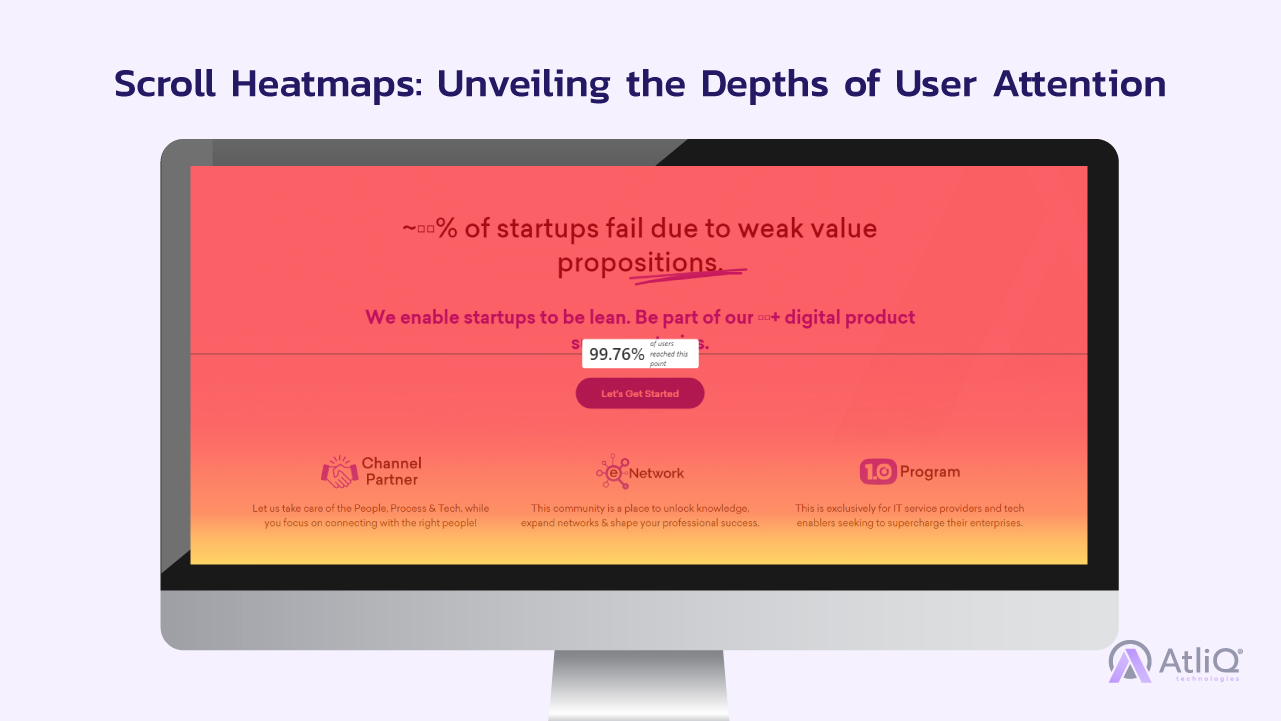
Scroll Heatmaps: Unveiling the Depths of User Attention
Scroll heatmaps go beyond clicks, revealing how far down the page users are scrolling. This data is crucial because valuable content placed “below the fold” (the area not visible without scrolling) might be going unseen.
- Content Placement Optimization: Does your key product information or special offer get buried at the bottom of the page? Scroll heatmaps can identify where visitor attention drops off. Reposition crucial content higher on the page to ensure maximum visibility.
- Engaging Storytelling: Is your long-form content failing to capture user attention? Scroll heatmaps can reveal where users lose interest. Use this data to break up text with visuals, improve readability, and ensure your story keeps users engaged until the end (where your call to action awaits!).
- Infinite Scrolling Efficiency: For websites with infinite scrolling, scroll heatmaps can show where users stop “loading more” content. This data helps you optimize the content flow and strategically place CTAs at optimal engagement points.
Attention Heatmaps: Where Do Eyes Meet Sales Opportunities?
Attention heatmaps are like a heat signature for user focus. They show where visitors hover their mouse or where their gaze lingers on the page. This data reveals what elements are visually grabbing attention and which ones might be getting ignored.
- Product Presentation Power: Heatmaps can expose areas of a product image that users find most engaging. Focus on highlighting those areas in your product photography to showcase key features and drive sales.
- Headline Heroics: Are your headlines failing to captivate your audience? Attention heatmaps can show if users are skipping over your headlines entirely. Craft compelling headlines that grab attention and entice users to delve deeper into your product or service.
- Call to Action Visibility: Use attention heatmaps to ensure your CTAs are visually prominent. If users aren’t noticing them, optimize the design, color scheme, and placement to make them stand out and encourage clicks.
Using Heatmap Data to Make Sales-Driven Changes
Heatmaps provide valuable insights, but the real magic happens when you translate that data into actionable changes that drive sales. By leveraging heatmap data and implementing these optimization strategies, you can transform your website from a passive brochure into a sales-generating machine!
Here’s how to leverage your heatmap intel for website optimization:
A/B Testing with Heatmap Insights
- Identify Areas for Improvement: Use heatmap data to pinpoint areas with low engagement or conversion rates. Is your CTA placement subpar? Are users scrolling past your key product information? These are prime candidates for A/B testing.
- Develop Competing Variations: Based on your heatmap findings, create alternative versions of the problematic element. Try different CTA button placements, test variations of your product descriptions, or experiment with multiple headline options.
- Run the A/B Test: Split your website traffic and show each visitor one of the variations you created. Heatmap tools often integrate with A/B testing platforms, making it seamless to track user behavior on each variation.
- Analyze the Results: Once enough data is collected, the A/B testing platform will reveal which variation performed better. This data removes guesswork and provides concrete evidence for optimizing your website for sales.
Optimizing Calls to Action
Your CTAs (calls to action) are the gateways to conversions, so optimizing them is crucial. Heatmaps can be a powerful tool in this process. They reveal where users are most engaged on your website, allowing you to strategically place your CTAs within these areas of high user focus. This strategic placement maximizes the chance of getting clicks and ultimately, conversions.
Heatmaps can also expose poorly designed CTAs that blend into the background or fail to stand out. By analyzing click heatmaps, you can experiment with different design elements like contrasting colors, clear fonts, and compelling CTA text. Think about the difference between “Buy Now” and “Learn More.” The first option is clear and action-oriented, while the second is more passive. By using clear and concise language that leaves no room for doubt, you can significantly increase your click-through rates.
In short, heatmaps can help you transform your CTAs from afterthoughts into conversion magnets, boosting your website’s sales potential.
Improving Product Presentation
- Highlight What Matters: Attention heatmaps reveal which areas of your product images capture user interest. Focus on prominently displaying those features in your product photography to entice potential buyers.
- Information Architecture: Heatmaps can show if users are missing crucial product information. Optimize your product pages to ensure key details like features, benefits, and pricing are readily visible and easy to digest.
- Visual Storytelling: Combine attention heatmaps with scroll heatmaps to see how far users scroll down product pages and where they lose focus. Use this data to strategically place high-quality visuals, customer testimonials, or compelling product descriptions to keep users engaged and drive sales.
Advanced Heatmap Techniques for Sales Optimization
Heatmaps are like x-ray vision for your website, but advanced techniques unlock even more sales potential.
Segmentation personalizes the experience. Heatmaps reveal how different user groups (new vs. returning visitors, mobile vs. desktop) interact with your site. This allows you to tailor content, promotions, and navigation for each group, leading to a smoother journey and ultimately, more sales.
Heatmaps + User Recordings = Conversion Gold. User recordings capture user behavior like clicks and scrolling. Combine this with heatmaps to understand the “why” behind user actions. Are they hesitating on a CTA because it’s unclear? Do they linger on a product due to confusion? These insights help you identify and fix roadblocks, boosting your sales conversions.
Customer behavior heatmaps are a game-changer for website optimization. By providing a visual representation of user interaction, they empower you to understand how visitors navigate your website, what grabs their attention, and where they might be getting lost. This data is gold for increasing sales, allowing you to tailor your website for a smoother user experience that converts clicks into customers.
Ready to unlock the full potential of heatmaps? At AtliQ Technologies, we’re passionate about helping businesses leverage cutting-edge technology to achieve their goals. Our team of IT and Business Consulting experts can guide you through the heatmap analysis process, translating insights into actionable strategies for website optimization. We’ll help you identify areas for improvement, personalize the user experience, and ultimately, turn website visitors into loyal customers.
Turn Website Visitors into Paying Customers with Heatmaps!
