Just like you wouldn’t invite guests into a messy home, you wouldn’t want customers navigating a website that’s hard to use or tough on the eyes. Think about the last time you walked into a place that felt just right – everything was easy to find and you had a great experience. That’s the magic good website design can bring to the table.
Whether you’re sprucing up an old website or creating a brand new one, the secret lies in two little things: UI and UX. It sounds like tech jargon, but they’re shorthand for making your website a friendly and inviting place for your visitors. We’re about to explore some simple but powerful ways to ensure your website’s design puts its best foot forward, just like a warm smile and a firm handshake.
Understanding UI and UX
In website design, “UI” and “UX” are often mentioned in the same breath, but they’re not identical twins. They’re more like close pals who complete each other’s sentences. Let’s get to know them a little better.
Explanation of User Interface (UI): Imagine your website as a car: the User Interface (UI) would be all the features you can touch and control, like the steering wheel, the dashboard, or the radio buttons. In web terms, UI includes the buttons you click on, the text you read, the images you see, and all the other items you interact with on a site. It’s the visual aspect of the website – its layout, color schemes, button styles, typography, and other design elements. A good UI’s goal is to look pleasing to the eye and make sure that the website’s tools are easy, clear, and enjoyable to use.
Explanation of User Experience (UX): Continuing with our car analogy, if UI is the car’s features, User Experience (UX) is how it feels to drive it. Does it make you feel confident on the road? Is it smooth or does it make you carsick? In web design, UX is all about the journey the user takes on your site. It’s how a visitor feels as they navigate from the homepage to other pages, and whether they can find what they need without frustration. It’s about creating a seamless flow that guides them from one step to the next, hopefully leading to the ultimate destination – a sale, a sign-up, or another conversion.
The Relationship between UI and UX
UI and UX work hand-in-hand. You can’t have a successful website with a pretty face (UI) or a good personality (UX), you need both to work together. A stunning website that’s hard to navigate is like a sleek sports car without an engine – it’s not going to take you very far. On the flip side, a site that’s easy to use but unattractive might get some visitors where they need to go, but they may not enjoy the trip enough to come back. Effective UI design attracts users to the website, and solid UX design keeps them there.
By focusing on both UI and UX, you ensure that visitors to your website are impressed by its appearance and delighted by its functionality. It’s all about creating a space that’s not only visually appealing but also intuitively serves the needs and desires of your users.
How to Approach UI/UX in a Website Revamp or New Design
Setting Goals and Objectives: Begin with the end in mind. Ask yourself what you want to achieve with the new design. Are you aiming to increase sales, boost user engagement, or improve customer satisfaction? Set SMART goals – specific, measurable, attainable, relevant, and time-bound – to guide the UI/UX process. These objectives will serve as your lighthouse, keeping the project on course and ensuring each design choice aligns with your end goals.
Research and Analysis of Target Audience: Now, let’s get to know who you’re designing for. Understanding your users’ needs, preferences, and behaviors is critical. Gather data through surveys, interviews, and analytics to paint a clear picture of who your audience is. Analyzing this information will help you make informed decisions about your design, ensuring that it resonates with those who matter most – your users.
Competitor Benchmarking: Keeping an eye on the competition can provide valuable insights. Look at websites that vie for the same audience attention as yours. Note down what they’re doing right and where they’re falling short. Competitor benchmarking helps you understand industry standards, emerging trends, and opportunities for differentiation, ensuring your UI/UX approach is not only competitive but also innovative.
Creating User Personas: It’s time to bring your audience data to life. User personas are fictional characters created based on your research to represent different user types that might use your site. These personas should include demographics, behavior patterns, goals, and frustrations. They help you empathize with and design for your audience’s specific needs.
Tools and Resources for UI/UX Enhancement
When you’re dedicated to delivering an exceptional digital experience, equipping yourself with the right tools and resources is paramount. Here’s a roundup of some must-haves for anyone looking to enhance their website’s UI/UX:
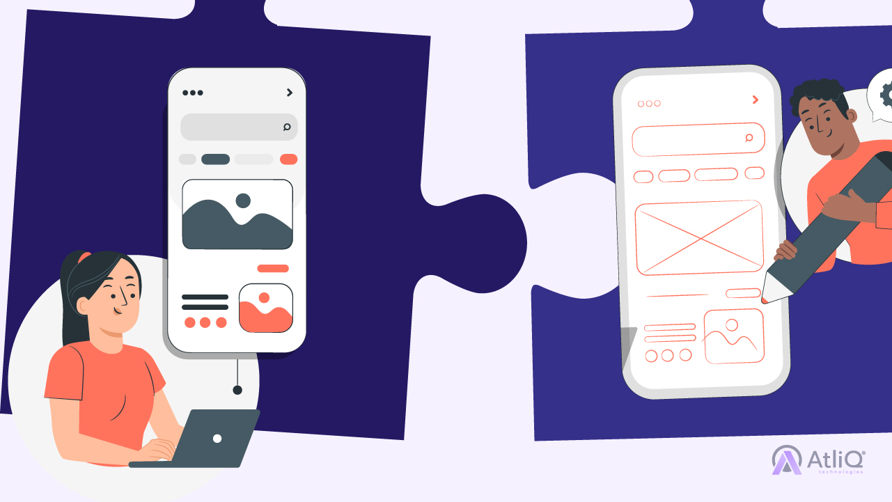
Prototyping and Wireframing Tools: Before you dive into coding, it’s crucial to sketch out the blueprint of your website’s design. Prototyping and wireframing tools are the answer, allowing you and your team to create preliminary layouts with ease.
- Sketch: Known for its simplicity and extensive plugin ecosystem, Sketch is a favorite among designers looking to create dynamic prototypes.
- Figma: This tool allows for collaborative live editing and prototyping, which is excellent for remote teams.
- Balsamiq: If you prefer to start with low-fidelity wireframes that focus more on function than form, Balsamiq’s user-friendly interface helps you craft them quickly.
User Testing Platforms: To ensure your UI/UX resonates with users, you need to test it on real people. Here’s where user testing platforms come into play:
- UserTesting: Offering a robust platform for live user feedback, it allows you to watch participants navigate your site and hear their thoughts out loud.
- Lookback.io: You can conduct remote user interviews and get live reactions, making it an excellent tool for understanding user sentiment.
Analytics and Heatmapping: Data is your compass in the UI/UX universe. Analytics and heat mapping tools can reveal how users interact with your site, which can be key in driving your design strategy.
- Google Analytics: A comprehensive tool that provides a wealth of data about visitor behavior, it’s essential for any digital toolbox.
- Hotjar: It goes beyond traditional analytics by offering heatmaps, session recordings, and other tools to visually represent user activity.
UI Kits and Design Systems: Consistency in design isn’t just a time-saver, it’s a hallmark of professionalism. UI kits and design systems provide reusable components and guidelines to ensure your design stays consistent across every page.
- Material Design: Google’s design system that offers guidelines, components, and best practices for a cohesive user interface.
- Bootstrap: A front-end toolkit for developing with HTML, CSS, and JS, it’s an excellent starting point for responsive, mobile-first projects.
Having these tools in your arsenal can tremendously improve the efficiency and effectiveness of your design process. As you leverage these to enhance UI/UX, remember that the goal is to simplify the user’s journey, making your site not only a visual joy but also a pleasure to navigate.
Best Practices for UI/UX Design
Mastering UI/UX design requires more than just using the latest tools and following current trends. It demands adherence to best practices that prioritize usability and ensure a great user experience.
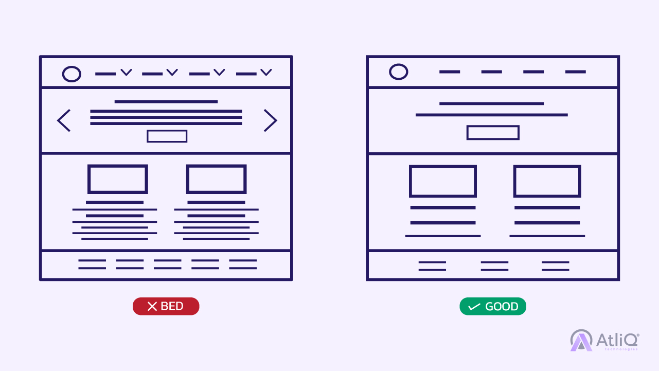
Simplified Navigation and User Flow: Good design is invisible. Users should not have to think too much about where to go next. Simplify the navigation of your site by reducing the number of options to the most important ones, and create a logical flow that effortlessly guides them through your website. Think of navigation as a map; it should be easy to read and direct users to their destination without unnecessary detours.
Consistent and Intuitive Interface Elements: Consistency is key in UI. Use common UI elements and arrange them in a way that feels familiar to your audience. This can range from sticking to standard iconography to maintaining uniformity in buttons and typefaces. An intuitive interface allows users to operate in a way that feels natural to them, leading to a comfortable and efficient experience.
Clear Call-to-Action Buttons: Users are on your site for a reason. Your job is to help them achieve their goal as quickly as possible. Clear and compelling call-to-action (CTA) buttons inform users about the next steps they can take. Whether it’s ‘Buy Now’, ‘Sign Up’, or ‘Learn More’, make sure your CTA buttons stand out and communicate their purpose. Well-designed CTAs can significantly increase conversions.
Feedback and Communication with Users: Users like to know that their voice is heard. Incorporate mechanisms that allow for feedback, such as comment sections, surveys, or contact forms. Open lines of communication help build a community around your site and brand. Plus, the feedback you receive is an invaluable resource for tweaking and improving your UI/UX design.
Regular Updating and Iteration: The digital landscape is perpetually shifting, and your website should evolve with it. Regularly review your site’s performance, and be open to making changes. A/B testing different elements and gathering user data can provide you with concrete insights on what works best. Be prepared to iterate on your designs in response to user feedback and analytics.
By following these best practices, you establish a strong foundation for creating a user-friendly, engaging, and successful website. Remember, great UI/UX design is an ongoing process of learning, adapting, and perfecting — always with the user’s needs at the heart of every decision.
Common Pitfalls to Avoid in UI/UX
Designing a user interface is a delicate balance between form and function. While there is no one-size-fits-all approach to creating the perfect user experience, there are some common missteps that can hinder your website’s effectiveness. Watch out for these pitfalls:
Overdesigning and Clutter: Less is often more in UI/UX design. An overly designed website may look stunning but can also overwhelm users with too much visual information, confusing them about where to focus or click next. Prioritize clarity over complexity. Use white space to your advantage, and keep the design clean to ensure users can navigate your site with ease.
Ignoring User Feedback: User feedback is invaluable—it’s a direct line to your audience’s thoughts and needs. Disregarding this feedback is a significant missed opportunity for improvement. Always listen to what users have to say about your site. It can reveal pain points and preferences that you might not have considered. Use this feedback to refine your interface and enhance the user experience continually.
Underestimating the Importance of Load Times: In an age of instant gratification, every second counts. A slow-loading website can turn users away before they’ve even seen what you have to offer. Optimize your site to load quickly by compressing images, minifying code, and leveraging browser caching. Remember, quick load times are directly tied to user satisfaction and retention.
Neglecting Cross-Browser and Device Testing: Your website might look fantastic on the browser and device you used to design it, but that doesn’t guarantee it will perform well across all platforms. Test your site on various browsers and devices to ensure it’s responsive and functions correctly everywhere. Issues like a button that doesn’t work on mobile or a layout that breaks in a different browser can severely impact the user experience.
Avoiding these pitfalls is essential for crafting a UI/UX that not only draws users in but keeps them engaged. Each of these elements plays a critical role in the holistic user experience. When you design with the user in mind and anticipate possible obstacles, you pave the way for a smoother, more enjoyable journey through your website.
In the journey of web design and development, giving prominence to UI/UX isn’t just about following a trend; it’s about acknowledging the power of a user-centric approach to create impactful and lasting digital experiences. As we’ve navigated through the intricacies of UI/UX design—from setting clear goals and understanding your audience to embracing best practices and avoiding common pitfalls—we emerge with a blueprint for a website that is not only visually appealing but also intuitively functional.
At AtliQ Technologies, we understand the pivotal role UI/UX plays in this process. With our expertise, we stand ready to help breathe new life into your website, ensuring that every element, from the typography to the user journey, is thoughtfully crafted to resonate with your target audience. Our team leverages cutting-edge tools and adheres to the industry’s best practices while placing your user’s needs and your business objectives at the heart of our design strategy.
Whether it’s a complete overhaul or subtle refinements, AtliQ Technologies is dedicated to enhancing the digital face of your brand. We take pride in creating bespoke UI/UX solutions that not only meet but exceed the expectations of modern users. As you ponder the future of your website, consider placing its UI/UX in the hands of experts who are as invested in your success as you are.
Turn your visitors into fans with a click; let AtliQ craft a UI/UX masterpiece for your website.


